Click below to read about the other elements.
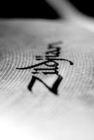
 The other element I often use is a narrow depth of field (DOF) by using a large aperture. By blurring backgrounds, or some of you subject matter, you add an automatic artsy effect. Your shots will often take on a more professional appearance. If you want to achieve a more narrow DOF and you are only working with a kit lens, I would recommend getting a inexpensive lens to get this effect in more of your photos. Both Cannon and Nikon make a 50mm 1.8 lens for around $100. All the photos in this post were taken using it. They are also great for portraits as they let in a lot of light and can easily blur your backgrounds. If you are only able to work with a kit lens, open the AP all the way up and put as much distance as you can between the subject and the background. That will always increase background blur.
Another element I use is off-camera flash. This is such a huge topic that I will be covering it in many, many other posts. It is yet another way to have your photos stand out from beginners.
Okay, so you don't have the money to buy a strobe? Check out some DIY sites and see what people have done with Home Depot work lights and PVC. If you practiced a little, you could have gotten a very similar effect. It's all about what you're into.
Now look back up at the top shot. It utilizes all the elements I just talked about: black and white, narrow DOF and directional lighting. I put them all together and I like the results. Of course you can use just one or two of these elements .... or discover some of your own. Don't start thinking the more the elements, the better the photo. Some of my favorite photographs are rather simple in their composition! You know, the above shot does have one other artsy element. Point Of View. I got down real low on the floor and shot up, keeping the guitar in focus.
One last point. Notice in the 2 photos containing people that there is no face, or a blurred face. There is a reason for that and I believe it adds to its artsy appeal. The human eye "looks" for human faces. When a face is obscured or not there at all, it allows you to focus on other subjects in the picture. You notice the guitar and the keyboard by removing some of the human element. They are less personal but much more artistic.
We paid more attention to these elements as photo students because that's what you learn first. I think we often forget about it as we become more technically proficient and pay more attention to other aspects (like lighting, for instance). Try adding back some of these elements. Post me some comments, we can discuss this further.


5 comments:
Hey, good stuff!! I'll be following you from now on :)
http://prefabtreehouse.blogspot.com/
Thanks S1nneran. I'm just starting off on Blogger; it's nice to have a have a fan!
Thanks for your comments on my photo work! :) This is a great blog, too.
No problem Lerin...looking forward to seeing more!
Thanks for posting your blog link. I finally stopped in to visit. Very interesting. Good job.
http://ruthikenneyphotos.blogspot.com/
Post a Comment